Here is an example provided in the CMS Github README:
{
  "negotiation_arrangement": "ffs",
  "name": "CPT codes",
  "billing_code_type": "CPT",
  "billing_code_type_version": "2020",
  "billing_code": "CSTM-00",
  "description": "All CPT codes",
  "negotiated_rates": [{
  "provider_groups": [{
    "npi": [6666666666],
    "tin":{
      "type": "npi",
      "value": "6666666666"
    }
  }],
  "negotiated_prices": [{
    "negotiated_type": "negotiated",
    "negotiated_rate": 12.45,
    "expiration_date": "2022-01-01",
    "service_code": ["18", "19", "11"],
    "billing_class": "institutional"
  }]
}
The most useful keys in this JSON object are the billing_code and the negotiated_rate. The provider_groups is typically not used as displayed
in their example, and instead the provider_references are used which point to a group ID which references the provider_groups elsewhere in the
JSON structure. This reduces repetition in the already enormous JSON files, when many negotiated_rates point to the same provider_group, which
may reference hundreds of NPI numbers.
Let's take a look at a plot of the negotiated rates for a single billing code 99213 for two different BCBSTX files, Blue Choice PPO and Blue Essentials.
Click the + and - buttons at the top right of the plot to adjust the bandwidth of the KDE plot, which controls the smoothness of the curve. This will either show
finer grained clusters with more peaks and noise, or a smoother curve with fewer peaks around the largest clusters. Tapping or hovering your cursor
over the plot on desktop will show the value at that point.
The above plot is a Kernel Density Estimatation (KDE) function which shows the distribution of negotiated rates for the two files. It's a plot of 1-dimensional data which shows the number of rates that appear near each value. The x-axis is the negotiated rate, and the y-axis is the density of rates around that value. Three values are highlighted above, $58, $113, and the maximum value, $482. The average, calculated as the total divided by the number of rates, is actually $102, and the median value is only $79.
If you're like me, having all those values doesn't give you a great idea of where most of the values actually are, and that's what the KDE plot is for. In the plot, we see that the largest density of rates is actually around $58, with another large cluster around $80. This makes sense with our median value of $79, which by definition 50% of the values fall below. However, our average is $102, which also makes sense because we see there's a good number of large values above the large $58 and $80 peaks.
$108 highlights another much smaller cluster, after which the rates taper off to the right, finally reaching the maximum value of $482.
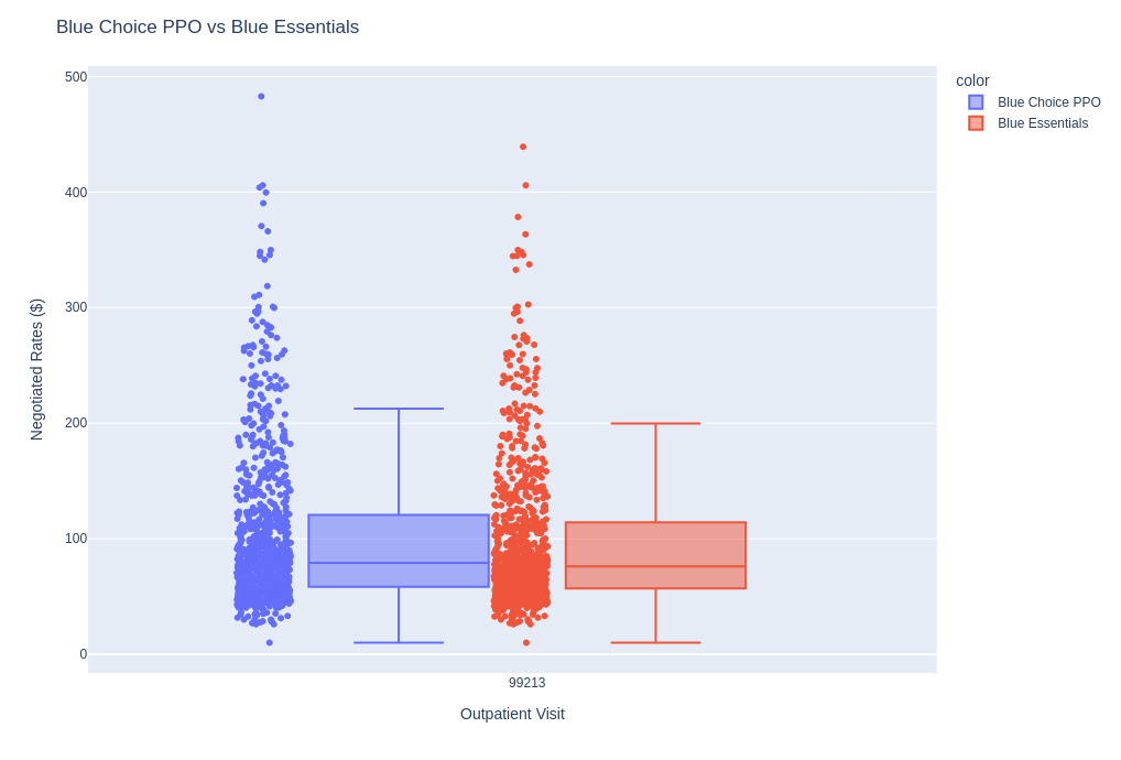
Why not just plot the actual data points so we can see where they are? Some of the files might have 50,000 rates. They can be so densely grouped that you can't actually get a good sense of how many values are in a particular area. Here's a box and whisker produced with Plotly, that also shows the individual points.

This doesn't give a great sense of where the values are, and these are not even particularly large databases at less than 900 values each. Another way to visualize the data would be to use a histogram, but then we need to do work in choosing the correct buckets to accurately represent the shape of the data, so I'm kind of partial to the KDE plot which handles this for us.
Below are some statistics about the two plan files used to generate the plot above.
| Database Name | Record # | Max | Avg |
| Blue_Essentials | 885 | 439 | 97 |
| Blue_Choice_PPO | 891 | 482 | 102 |
In the next article, we will look into an anomaly in the UnitedHealth data. Please consider subscribing to support our articles, or to access our paid search utilities to perform your own research. Feel free to contact us with any questions or suggestions, and head over to the query page to access our free search utilities, or check out more of our articles.
